
Unlike machines, humans struggle with large quantities of rich, diverse data. The sheer amount can be overwhelming, insights can be hard to ascertain and ultimately it can be time-consuming to comprehend.
Simply put; we are not built for it.
Instead, we are sensory creatives. How data is structured or presented goes a long way towards our understanding of what it is. What it looks like, how it's ordered – even how it sounds in some cases – can all affect our perception of it.
The implication of all this, from a business perspective, is that how well we understand and organize the data in front of us, determines how well it can ultimately be utilized later.
Enter visual data: An umbrella term that’s used to define the different ways in which data or insights can be conveyed to a user through how it looks. This can be something as simple as a pie chart or graphic, or as complex as an interactive piece of software that can help manage large-scale projects.
Both of these examples, regardless of their relative sophistication, can determine how cost-effective or efficient a process can be and can later influence future decision-making within a business.
In today’s blog, we’re going to dive a little bit deeper into the concept of visual data, how we utilize it at Cyberhawk, and explain why we're so passionate about it.

Why Visual Data?
Often when we hear figures or encounter large swathes of data, they quickly can lose their meaning due to their scale or ambiguity.
For example, if you were to learn that the deepest part of the ocean is approximately 11,000 meters deep, it’s difficult to comprehend the depth of it from that figure alone. However, if you watch the below video as a visual representation of that figure, it becomes instantly more fathomable.
Source: reddit.com/r/Damnthatsinteresting/comments/q6n3vw/how_deep_is_the_ocean/
This is the essence of effective data visualization. Finding the right medium to convey succinctly what the inference of the raw data means.
Cyberhawk and Data Visualisation
Organizations in sectors such as construction, energy, and power are asset-intensive. They rely heavily on their critical assets’ performance to drive business efficiency. As facilities and infrastructure age, enhancements in efficiency and consistent asset maintenance are integral to keeping within safety guidelines and remaining competitive in the market.
In order to do this, it is imperative that asset-intensive companies make the most of the proliferation of big data, sensors, and analytical techniques, along with the latest advancements in reality modeling, asset performance modeling, and 3D visual operations.
Companies in these sectors can utilize data to help monitor critical assets, their usage, age, and health. They can also track maintenance history and enable better decision-making on their assets and portfolio more generally.
For example; advanced analytics, reliable asset management software, and big data are helping transmission and distribution operators lower their asset-management costs, improve performance and capture more value.
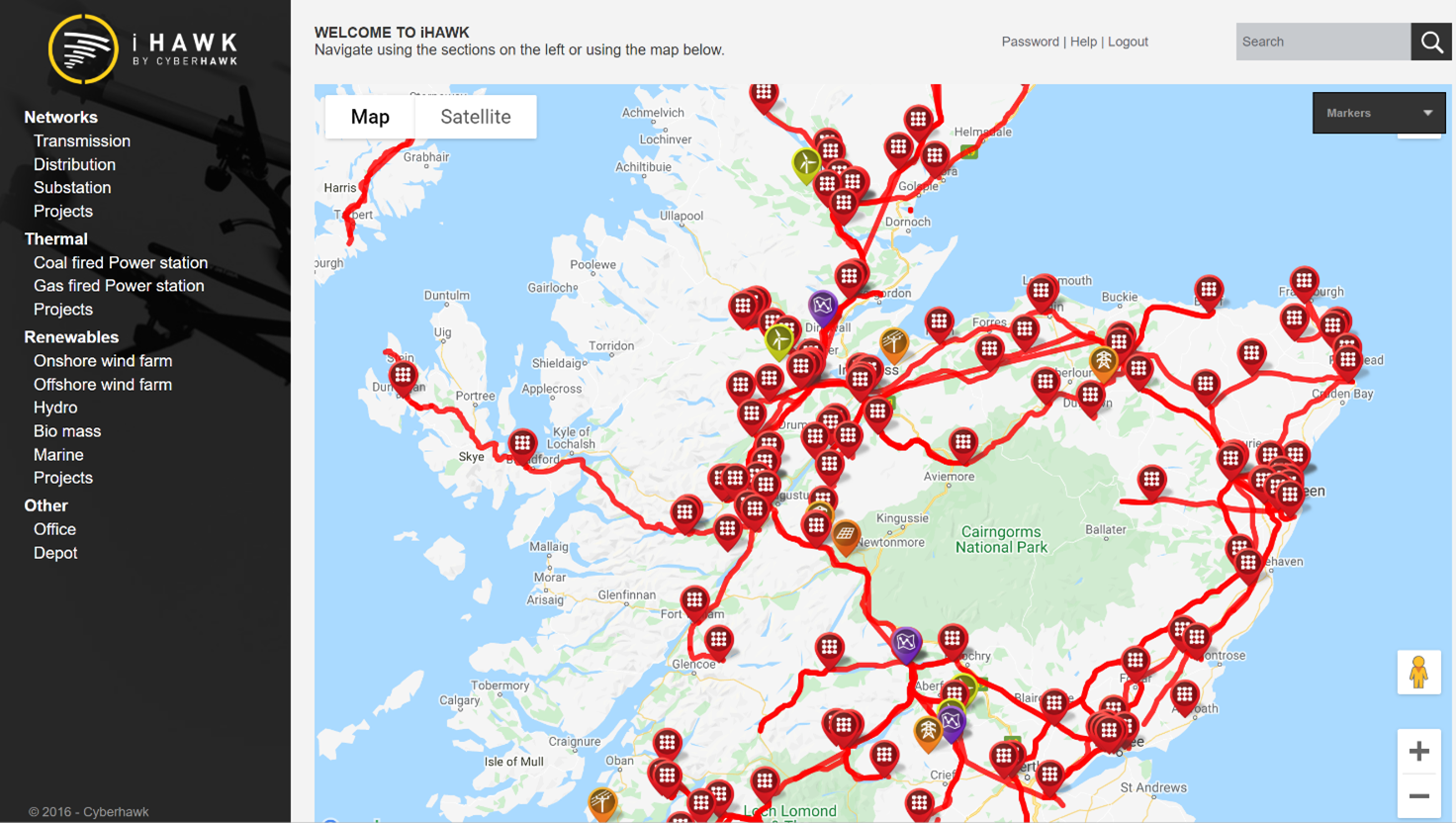
Notably, visual data management systems like iHawk, help engineers, asset owners, and integrity managers keep track of their vast pools of visual data and help organize data into a single source of truth.
Visual Data Examples
There is no one catch-all example that exemplifies all visual data. Instead, it is an umbrella term that caters to many different models that all have separate uses within different workflows. Below we’ve listed some in use at Cyberhawk.
3D Mesh Models
A 3D mesh model is a digital build of a physical structure made up of polygons. 3D meshes use reference points in X, Y, and Z axes to define shapes with height, width and depth.
At Cyberhawk we commonly use this method to create replicas of monumental offshore platforms. We create them because physical work surrounding these structures can often be dangerous and expensive.
Luckily, mesh models can emulate to scale - and with incredible visual detail – exactly how the mesh appears visually.
Using our in-house software solution iHawk, we can help plan moves on offshore platforms thousands of miles away in the middle of the ocean or assist in the decommissioning process by evaluating the degradation of its component parts.
These findings can assist project managers or engineers prioritize and organizing their workflow based on the data at hand.
Our in-house visualization tool iHawk lets you see the degradation levels of a platform in incredible detail.
If you are interested in learning how our mesh models help revolutionalized offshore work, you can learn more about it here.
Immersive ANNOTATED Imagery
Drone technology has revolutionized so many sectors and asset maintenance is one such example. It has allowed us to inspect overhead lines by utilizing expert pilots and engineers to shoot high-definition video footage of towers while they’re still live. This imagery is then displayed on iHawk with accompanying annotations of any faults found by our engineers.
This quick, immersive method of displaying the data empowers utility providers to make decisions and manage repairs based on categorical visual evidence.
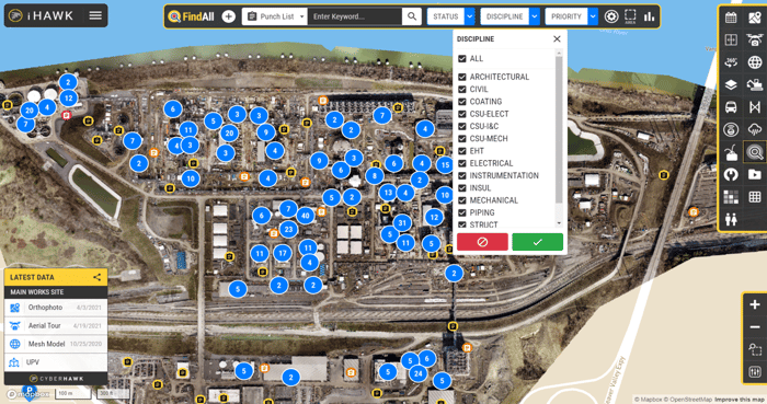
Project Management Software
In lengthy construction projects, with countless stakeholders, management and prioritization of workflows can become muddied and costly.
More and more, we see traditional processes transform from pen and paperwork to more streamlined digital solutions.
For instance, as part of the construction management functionality of iHawk, the project punch list can be viewed visually as a map and be filtered or sorted dependent on the discipline or urgency of the required task.
What used to be complex and time-consuming to manage, is now a much more efficient process because of how the data is visualized and understood by the user.
Learn more
Want to learn more about iHawk, you can do so here.